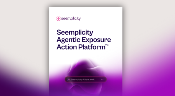

Logo
Our logo combines the Seemplicity wordmark and the logomark. It shows up everywhere we do. A symbol of clarity and action, it tells the world that security risks don’t just get found. They get fixed.
Logo Variants
The Seemplicity logo comes in two forms. The full lockup pairs the logomark with the wordmark and is the default for most uses. The logomark works on its own in tight spaces like app icons, favicons, and social avatars where the brand is already established.
Default Logo Lockup
Logo mark
Vertical Logo Lockup
Logo Color Versions
The logo is available in full colour, white, and black. Use full colour on light backgrounds, white on dark backgrounds, and black for single-colour print applications.

Full Colour

Black

White

Color on Dark

White on Dark
Size and Borders
Keep the logo clear and legible at every size. The minimum clear space around the logo is equal to the size of the logomark on all sides. This keeps it sharp and uncluttered no matter where it sits.
Minimum logo sizes
Print: 6mm high
Digital: 35px high

Logo Don’ts
The logo works best when left untouched. To keep it looking its best, avoid these common mistakes.
Don’t stretch or distort the logo.

Don’t scale the logomark and wordmark separately.
Don’t rotate or place the logo at an angle.

Don’t add shadows, glows, or any other effects.
Don’t recolour the logo outside the approved variants.

Don’t place it on busy or low contrast backgrounds.

Don’t combine it with other logos or brand names.
Don’t use the logo image mask.

Don’t recreate or retype the wordmark. Always use the original files.
Color
Below is the official Seemplicity color palette. Stick to these colors and avoid introducing new ones. The palette is built around a dark foundation with bright accents that bring energy and focus. Use dark tones for backgrounds and surfaces, white for readability, and the accent colors to highlight what matters most. When in doubt, keep it simple and high contrast.
Colors – Primary
Pink
#E3308C
RGB
227,48,140
CMYK
0,79,38,11
Purple
#A309BB
RGB
163,9,187
CMYK
13,95,0,27
Dark Purple
#410051
RGB
65,0,81
CMYK
20,100,0,68
White
#FFFFFF
RGB
255,255,255
CMYK
0,0,0,0
Dark
#0B0623
RGB
11,6,35
CMYK
69,83,0,86
Teal
#36F2BA
RGB
54,242,186
CMYK
78,0,23,5
Grey
#F5F5F5
RGB
245,245,245
CMYK
0,0,0,4
Dark Grey
#A0A0A0
RGB
160,160,160
CMYK
0,0,0,37
Colors – Secondary
Seemplicity Blue
#4500F9
RGB
69,0,249
CMYK
72,100,0,2
Electric Violet
#8752FA
RGB
135,82,250
CMYK
46,67,0,2
MAUVE MAGIC
#CD83FF
RGB
205,131,255
CMYK
20,49,0,0
DARK AMETHYST
#1A0047
RGB
26,0,71
CMYK
63,100,0,72
MIDNIGHT
#09001B
RGB
9,0,27
CMYK
67,100,0,89
STRONG CYAN
#09CDCC
RGB
9,205,204
CMYK
96,0,0,20
Gradient
Gradient 1
315 DEG
#410051 | #E3308C
Gradient 2
90 DEG
#410051 | #E3308C
Typography
Type is how Seemplicity speaks on the page. Our typefaces are chosen for clarity, readability, and a modern technical feel. Every piece of text should be easy to read at any size and on any background. Follow the established type styles and sizes below to keep things consistent across all materials.
Typeface
Seemplicity uses three typefaces, each with a clear role.
/the agentic exposure action platform
AI turns findings
into fixes —Automatically. Accurately. At scale.
AI agents and automation across every stage of exposure management reduce noise, accelerate fixes, and shrink risk faster than any other platform.
Cabinet Grotesk
The display and heading typeface. Used for titles, section headings, and any text that needs to make a statement. Available in Extralight, Light, Regular, and Bold. Use Bold for primary headings and lighter weights for visual contrast in layouts.
/the agentic exposure action platform
AI turns findings
into fixes —Automatically. Accurately. At scale.
AI agents and automation across every stage of exposure management reduce noise, accelerate fixes, and shrink risk faster than any other platform.
Mona Sans
Our primary body typeface. Used for paragraphs, descriptions, UI text, and anything that needs to be read comfortably at length. Available in Regular and Bold. This is the font people will spend the most time reading, so legibility is the priority.
/the agentic exposure action platform
AI turns findings
into fixes —Automatically. Accurately. At scale.
AI agents and automation across every stage of exposure management reduce noise, accelerate fixes, and shrink risk faster than any other platform.
Space Mono
A monospaced typeface used sparingly for eyebrow text, labels, tags, metadata, and small supporting elements. It adds a technical texture to the design but should not be overused. Keep it to short strings of text, never full paragraphs.
Type Scale
Title 1
font-family: ‘Cabinet Grotesk’;
font-style: normal;
font-weight: 200;
font-size: 100px;
line-height: 100%;
Title 2
font-family: ‘Cabinet Grotesk’;
font-style: normal;
font-weight: 300;
font-size: 86px;
line-height: 100%;
Title 3
font-family: ‘Cabinet Grotesk’;
font-style: normal;
font-weight: 300;
font-size: 66px;
line-height: 100%;
Title 4
font-family: ‘Cabinet Grotesk’;
font-style: normal;
font-weight: 300;
font-size: 60px;
line-height: 100%;
Title 5
font-family: ‘Cabinet Grotesk’;
font-style: normal;
font-weight: 300;
font-size: 46px;
line-height: 120%;
Title 6
font-family: ‘Cabinet Grotesk’;
font-style: normal;
font-weight: 400;
font-size: 36px;
line-height: 100%;
Title 7
font-family: ‘Cabinet Grotesk’;
font-style: normal;
font-weight: 400;
font-size: 28px;
line-height: 120%;
Title 8
font-family: ‘Mona Sans’;
font-style: normal;
font-weight: 700;
font-size: 22px;
line-height: 120%;
Title 9
font-family: ‘Mona Sans’;
font-style: normal;
font-weight: 700;
font-size: 14px;
line-height: 140%;
Body
font-family: ‘Mona Sans’;
font-style: normal;
font-weight: 400;
font-size: 18px;
line-height: 160%;
Body Small
font-family: ‘Mona Sans’;
font-style: normal;
font-weight: 400;
font-size: 16px;
line-height: 140%;
Body XS
font-family: ‘Mona Sans’;
font-style: normal;
font-weight: 400;
font-size: 14px;
line-height: 140%;
Tab 1
font-family: ‘Cabinet Grotesk’;
font-style: normal;
font-weight: 400;
font-size: 46px;
line-height: 100%;
Tab 2
font-family: ‘Mona Sans’;
font-style: normal;
font-weight: 700;
font-size: 22px;
line-height: 120%;
Tab 3
font-family: ‘Space Mono’;
font-style: normal;
font-weight: 400;
font-size: 14px;
line-height: 160%;
Link
font-family: ‘Mona Sans’;
font-style: normal;
font-weight: 700;
font-size: 12px;
line-height: 160%;
Button 1
font-family: ‘Mona Sans’;
font-style: normal;
font-weight: 700;
font-size: 16px;
line-height: 100%;
Button 2
font-family: ‘Mona Sans’;
font-style: normal;
font-weight: 700;
font-size: 14px;
line-height: 100%;
tag 1
font-family: ‘Space Mono’;
font-style: normal;
font-weight: 700;
font-size: 14px;
line-height: 160%;